Designing a nearest hospital finder for safety documents that surfaces critical info first
Timeline
2024
When someone on a construction site needs an ambulance, nobody has time to scan through a 60-page printed document looking for the nearest A&E. I redesigned where that information lives, how it's presented, and what data it pulls from, so the answer is always readily accessible on the first page in multiple formats with no need for searching.
The Problem
Picture this. Someone near you on a project site needs immediate medical assistance. You've called the emergency services. You're armed with a 60-page printed RAMS document that outlines all the different protocols for risk management. Now what?
Construction sites are dynamic environments. Maps go out of date fast… there's a new trench dug next to Gate 2, a road that's been cordoned off, an access point that didn't exist last week! Even people who've worked in the same office for years can't necessarily recall their postcode under pressure. Now imagine you're standing in the middle of a construction site in an unfamiliar area, possibly with dodgy internet.
The problems stack up:
You can't find the information: In existing RAMS documents, the nearest A&E details (if they're included at all) are buried somewhere in the middle of the document. There's no standard location for it. Under pressure, you're scanning pages trying to figure out where someone decided to put the emergency info this time.
The information doesn't help: Even when you find it, you can't just tell the emergency services "we're at the project site", what they see on Google Maps rarely reflects the current state of the construction. And if you need to drive the patient to hospital yourself, you're navigating from an unfamiliar location with potentially unreliable connectivity.
The format doesn't fit the moment: A text address on page 34 of a printed document is almost useless when you need to act in seconds. You need something you can glance at, scan, tap, or hand to a paramedic, not something you have to read.
Users
Document consumers: Work on the project site, access the RAMS doc for information in case of emergencies
Document creators: Find and add the relevant information to RAMS doc
What I did
Identified the nearest hospital information as a critical safety gap hiding in plain sight. Qualitative research with 9 customers surfaced the real constraints:
"Sometimes sites don't have a postcode until much later."
"There is no easy way to tell if the hospital has A&E services."
"…RAMS are available onsite as printed docs, so personnel have to open Google Maps, then type out everything to see directions."
Most RAMS documents technically had a process for emergencies, but the design of the document itself was working against the people who needed it most.
Proposed moving emergency information to the first page of every RAMS document, despite common industry practice of burying it mid-document. I ran a whiteboarding session with PM, Dev (Tech Lead), and the Customer Success Manager to position the feature in the existing product. This wasn't a small layout change - it challenged established conventions about how safety documents are structured, and needed H&S expert and legal reviews to get approved. Crucially, no legal specification existed for placement, so the first-page decision was a design call, not a regulatory one.
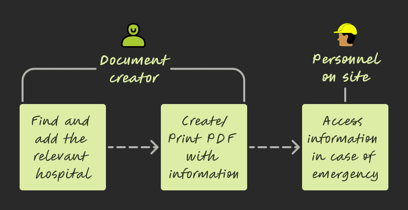
Scoped the solution across three layers: the information architecture (where it lives), the presentation (how it's consumed in different scenarios), and the data source (what it pulls from and how it stays accurate). I partnered with devs on API documentation and requirements, and with PM to estimate usage, costs and tradeoffs — then pitched to leadership for buy-in on the third-party solutions we'd identified.
Integrating information across different third parties like the NHS services and Google Maps
Designed a multi-modal emergency information system built into the first page of every RAMS document:
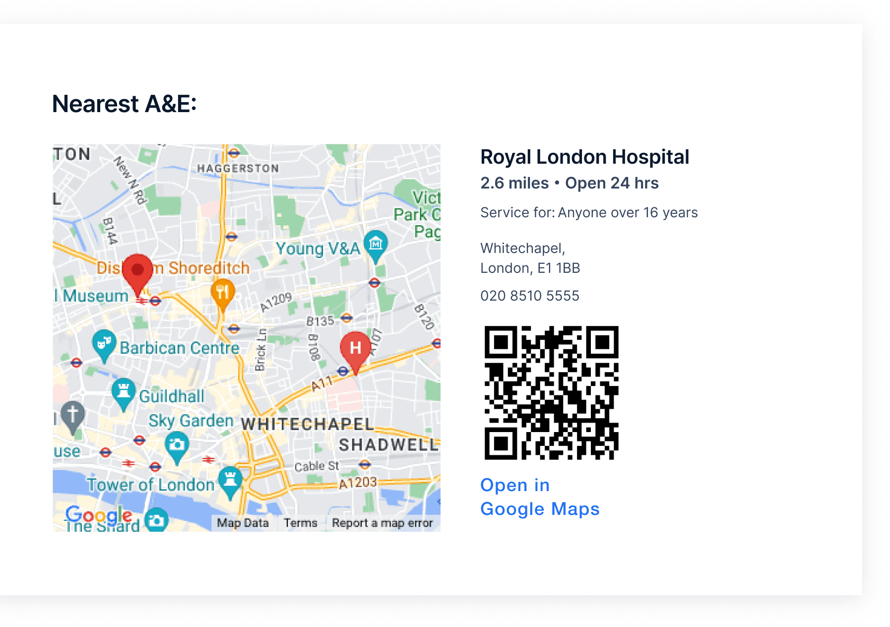
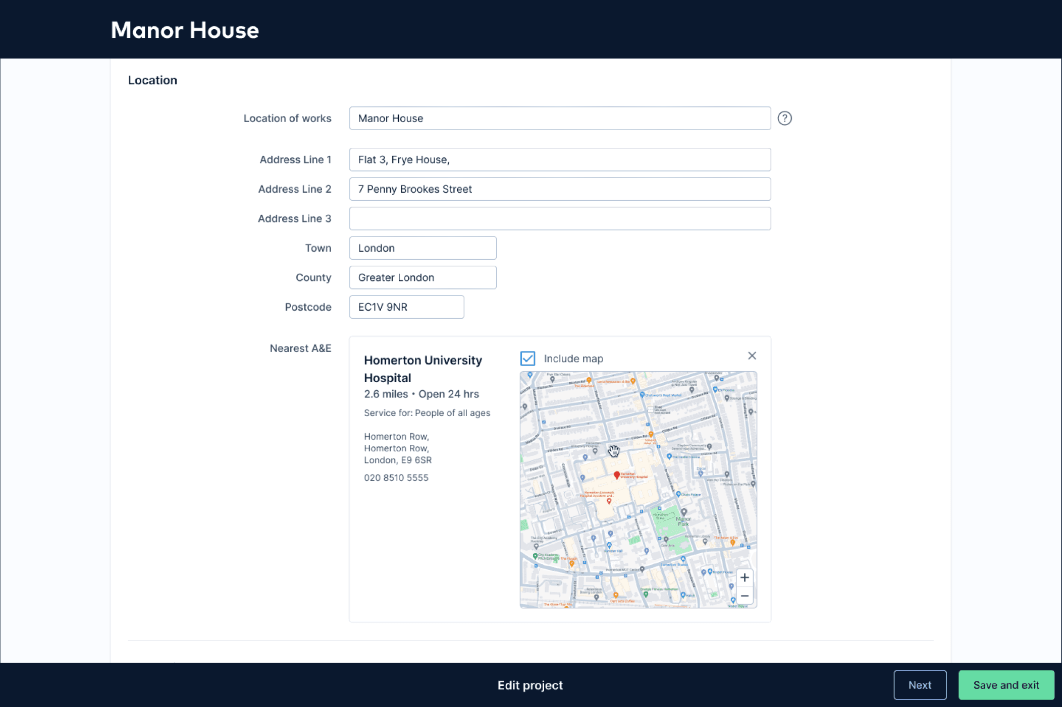
1. Printed map of the site and nearest A&E: readable by human eye even when printed on an old black-and-white printer. This meant careful decisions about zoom levels, contrast, label sizing, and what to include vs. leave out so the map was legible at print scale without colour.
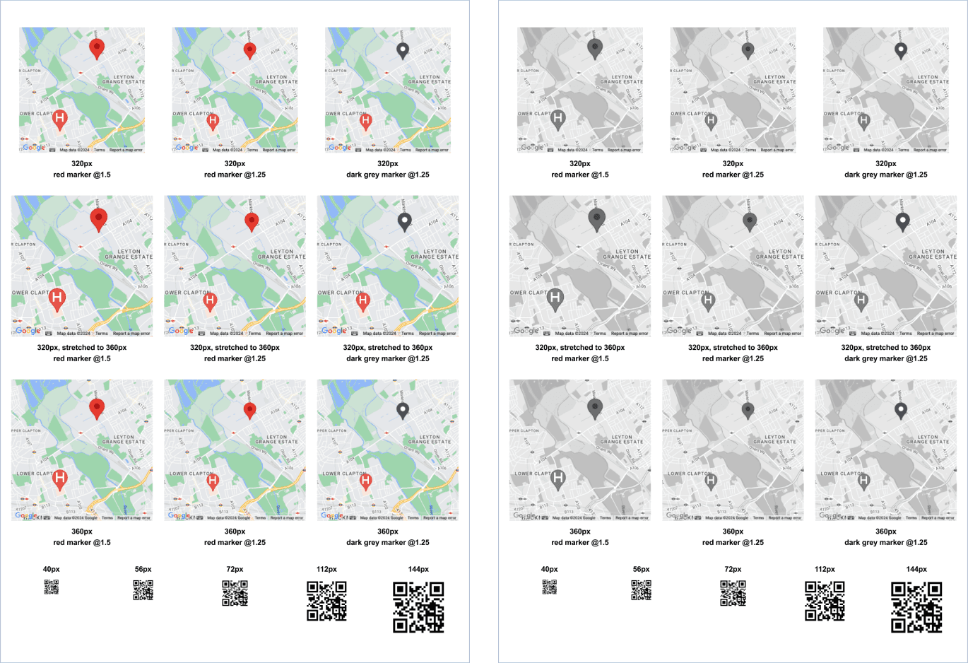
Legibility testing for pin size, labels, QR code, when printed in colour as well as in black and white
2. QR code: scannable directly from a printed document, leading straight to Google Maps with directions to the nearest A&E. For the scenario where you're holding a physical document and need navigation immediately.
3. Clickable link: for when the RAMS is being viewed digitally. One tap to Google Maps with the route pre-loaded.
Information designed for reading manually, scanning with a device (QR code) or directly navigating digitally (hyperlink)
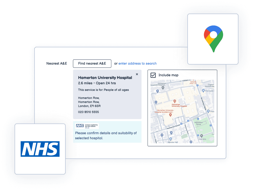
4. NHS data integration: the nearest A&E is pulled from reliable NHS data sources, filtered to exclude irrelevant specialty care (children's hospitals, eye care centres, etc.) so the result is always an appropriate emergency department for the situation.
All of this sits right next to the site address on page one. No scanning, no searching, no guessing.
Shipped as part of the core RAMS document generation flow. Every new document automatically includes the emergency information block.
While creating the RAMS document, the address is seamlessly pulled into the NHS services search, surfacing the most relevant hospitals
Design decisions that mattered
First page, no exceptions. The biggest fight was the simplest change. Industry convention puts emergency info deep in the document. Moving it to page one meant challenging that convention and getting it through expert and legal review. The argument was straightforward: in an emergency, page one is the only page that matters.
Multi-modal by design. A single format can't cover every emergency scenario. Printed document on a muddy site with no signal? You need the visual map. Standing next to the casualty with your phone in hand? You need the QR code. Reviewing the document on a laptop in the site office? You need the clickable link. Each format serves a different moment of need.
Legibility under worst-case conditions. The map had to be readable when printed in black and white on a cheap site office printer. That ruled out relying on colour for any critical information. Zoom levels had to show enough context to be useful but not so much that the A&E marker became a speck. Every label had to be legible at reduced print quality.
Filtered to be relevant, not just "nearest." The raw data includes every hospital, like children's units, specialist eye care, clinics that don't handle trauma. Showing the nearest facility by distance alone could send someone to a place that can't help them. Filtering down to appropriate A&E departments meant the first result is always the right result.
The Outcome
Emergency info location: from buried mid-document → first page of every RAMS document
Formats available: 3 (printed map, QR code, clickable link) which covered every access scenario
Data source: NHS verified, filtered to relevant A&E departments only
Projects with A&E information added: 19,000+
Feature adoption: 98% (near activation, at time of launch)
User testing: 7 out of 7 participants completed the task without any prompting
First-page validation: 3 testers unprompted praised the first-page placement during testing
Roadmap impact: prompted roadmap changes for 2025-2026: exploring QR codes across RAMS, V2 with What3Words integration + nearest defibrillator
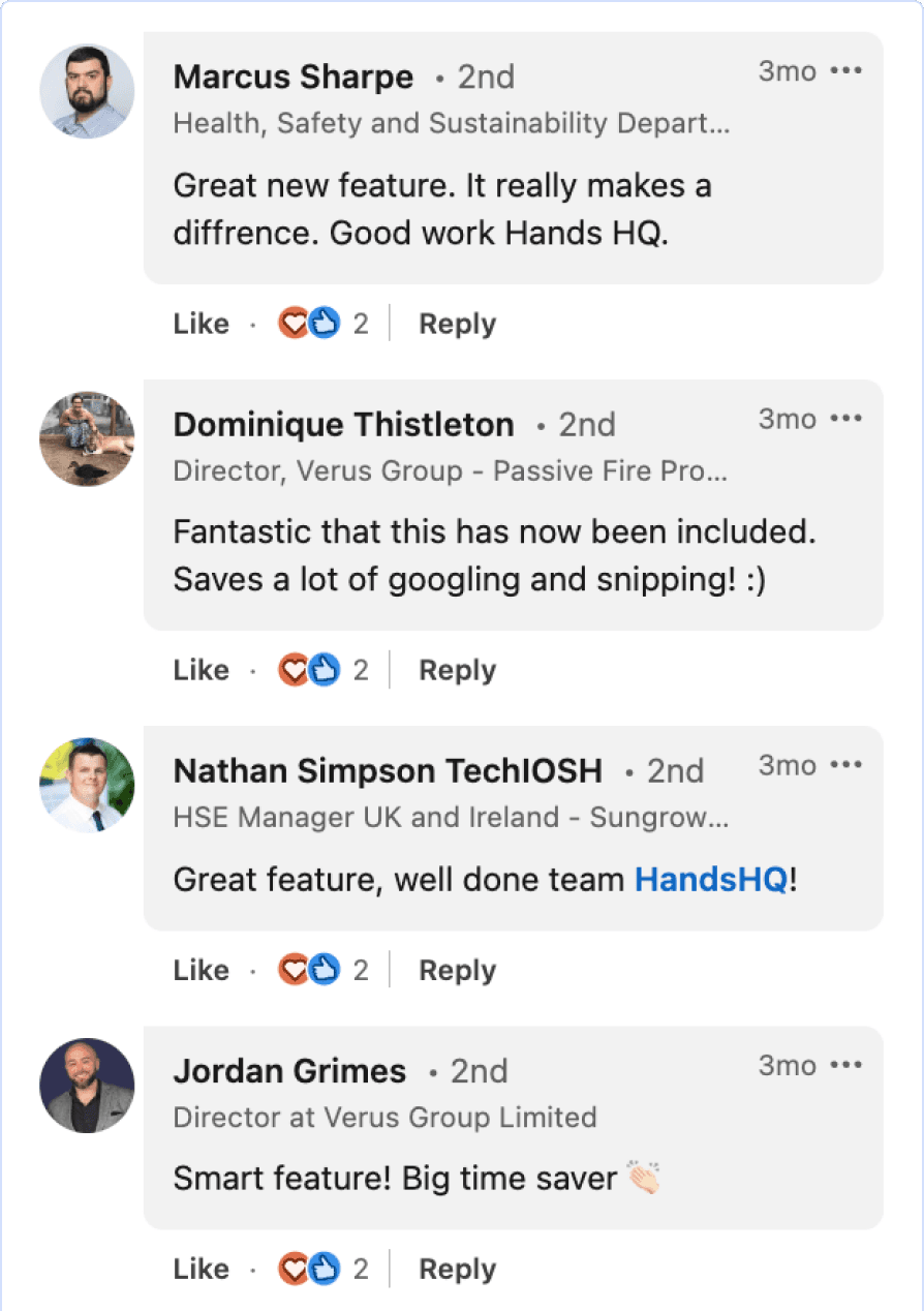
Customer responses to feature launch post (LinkedIn)
What came next (designed, not shipped)
Before leaving the role, I designed the next iteration to completion and handed it off:
What3Words integration: embedding W3W addresses in the localised site map so emergency services can be guided to the exact location on site, not just the site boundary. Construction sites are large and complex — "we're at the project site" isn't specific enough when someone needs to find you among cranes and scaffolding.
Nearest defibrillator: replicating the same pattern (first page, multi-modal, verified data) for the nearest publicly accessible defibrillator, for cardiac emergencies where every second counts.
Why this matters for what I do next
This project is about designing for the worst moment of someone's day. There's no onboarding flow, no progressive disclosure, no "we'll teach you how to use this." The user is panicking, the stakes are real, and the design either works instantly or it doesn't work at all.
That constraint of designing something that works reliably under pressure, for someone who didn't choose to be using it in that moment, is the kind of problem I want to keep solving.

