250 Styles. 475 Components. Design system built from scratch... Code-design parity achieved.
Timeline
2024
HandsHQ didn't have a design system. I saw the need, made the case, and built the whole thing.
The problem
HandsHQ was growing. 13,000+ active projects on the platform (at time of launch), a product that touched safety-critical workflows, and no design system to hold it together.
What that looked like in practice: the same button rendered differently in three places. Form inputs had inconsistent padding depending on which page you were on. Engineers were building the same components from scratch, sprint after sprint, because there was no shared library to pull from. Design reviews spent more time on "should this look like that?" and "I think we have a similar element elsewhere" than on whether the product was solving the right problem.
None of this was catastrophic on its own. It was the kind of debt that accumulates quietly, until you're shipping features at speed and every new screen introduces three new inconsistencies. For a product where users create safety documentation for high-risk environments, inconsistency isn't just a polish problem. It's a trust problem.
Nobody asked me to build a design system. I saw the gap, recognised it as a scaling bottleneck, and pushed for it.
What I did
Identified the absence of a design system as a compounding problem. Every feature shipped without one added to the inconsistency, and every inconsistency made the next feature harder to build and review. The longer we waited, the more expensive it would get.
Proposed building a design system from scratch, not patching what existed, but creating a proper foundation: design tokens, a component library in Figma, coded components in parity, and documentation that meant engineers and designers were always looking at the same truth.
Scoped a dedicated sprint to build the foundation. The strategy was to get the core right in a focused block, then maintain and extend alongside feature work. V1 wasn't everything, but it covered all the components that touched the most screens and had the most variance.
Designed and built the full system:
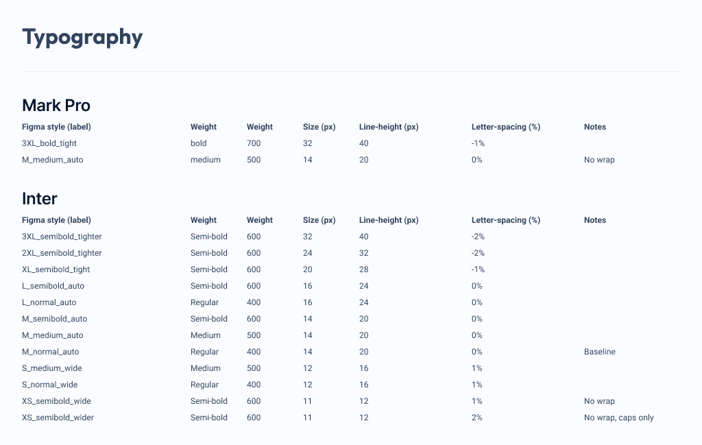
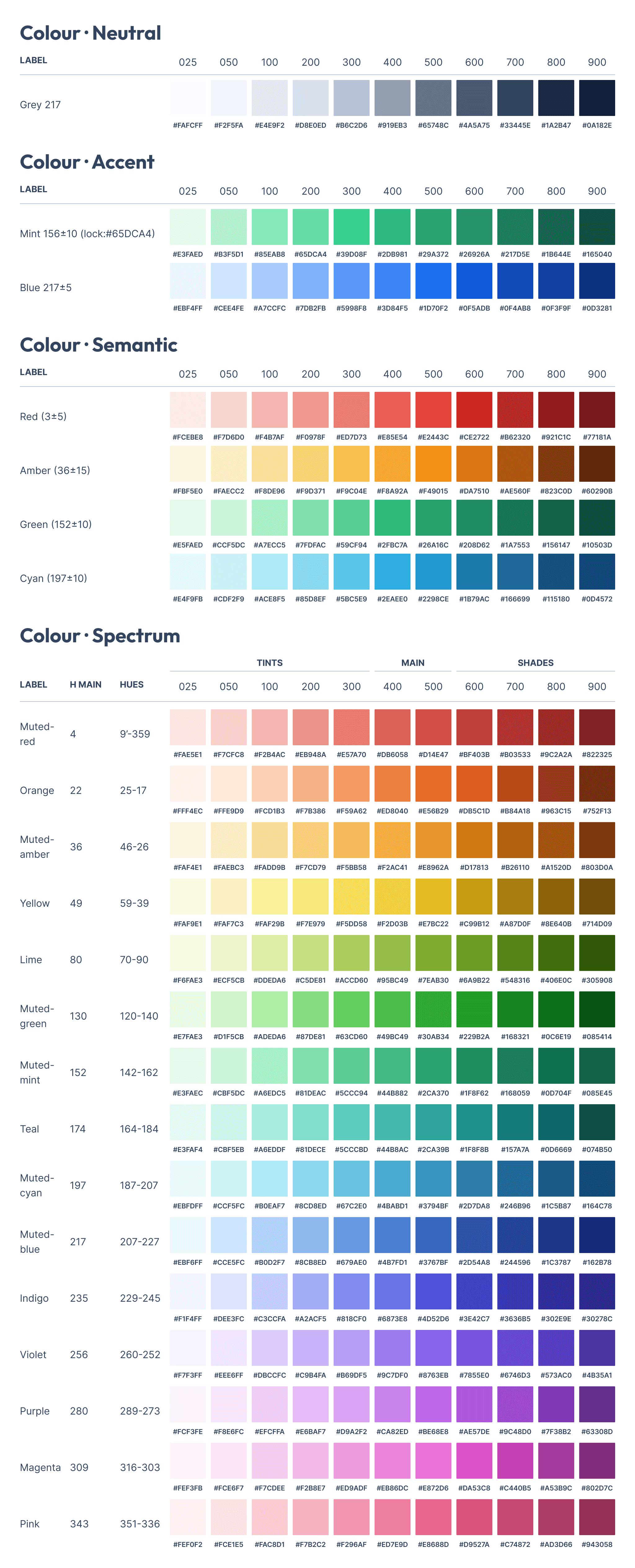
Design tokens: colours, typography, spacing, elevation. The atomic decisions that everything else inherits from. Change a token, and every component that uses it updates. This is what makes a system scale instead of just being a collection of components.
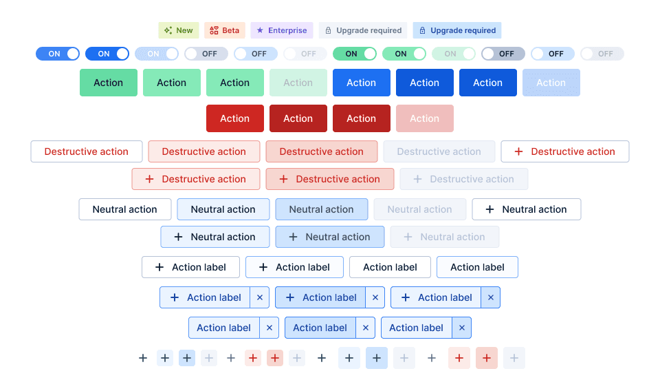
Component library in Figma: 475+ components with variants, states, and documentation. Structured so any designer (or future designer) could find what they needed, understand the intended usage, and use it correctly without asking me.
Icon dictionary: a catalogued, consistent icon set integrated into the Figma library. No more "which icon did we use for this?" conversations.
Code-design parity: the Figma library and the coded components stayed in lockstep. What you saw in Figma was what engineers built. This was the difference between a design system that people reference and one that people actually use. Single source of truth meant smooth handoff every single time.
Shipped the foundation, then maintained it alongside every feature sprint. The system grew as the product grew.
The design decisions that mattered
From zero, not from patches. It would have been faster to document what existed and call it a system. But existing patterns had evolved organically. Some were good, some were legacy compromises, and just enlisting them wouldn't fix the underlying inconsistency. Starting clean meant every component was intentional.
Dedicated sprint for the foundation. Trying to build a design system "on the side" while shipping features is a recipe for a half-finished library that nobody trusts. A focused block to get the core right meant the system was immediately useful, which meant people actually adopted it.
Code parity as a requirement, not a nice-to-have. A Figma library that doesn't match the codebase is a suggestion, not a system. Maintaining parity meant engineers could trust what they saw in the designs, and designers could trust that what shipped matched their intent.
Sole ownership with clear governance. I owned the system end-to-end. That made decisions fast, but it also meant building the system so it could outlive me, with clear naming, documented usage patterns, and enough structure that a future designer could pick it up and keep going.
The outcome
250+ Figma styles: design tokens covering colour, typography, spacing, and elevation.
475+ components: with variants, states, and usage documentation.
Code-design parity maintained across the product through tailwind classes.
Single source of truth: Figma library was the reference for both design and engineering.
Handoff quality: cited as the key factor in smooth feature delivery (from Data Tables + Folders project retrospective).
Engineering impact: looping engineering in early (from sketch phase) helped parallelise discovery and build. The system made this possible because everyone was working from the same components.
~4-5 people-hours saved every sprint, with fewer one-off components built, faster design reviews, less back-and-forth on visual consistency.
Why this matters for what I do next
A design system is the highest-leverage thing a product designer can build. Every hour invested in the system saves multiples of that across every feature that uses it. And it changes the nature of design reviews, from "does this look right?" to "does this solve the right problem?"
This project gave me a solid foundation to maintain the design system directly in code for Caribou in 2026.